Statement Of Intent
Mindmap for The Choice Of Colour

Moodboard with different ideas

Jacob Reischel
Design duo Marie Jacob and Julia Strathmann (Reischel), are the two talented ladies behind Jacob Reischel. Marie started her career as a photographer and Julia as a graphic designer. They both decided to come and work together. Their work includes design projects for magazines and webpages but they focus largely on creating concepts and colour.
Daroo Photography

I have chosen Daroo Photography because I like the way he blends different colours. Also, I like that he uses simple ideas, and turning them into something that looks beautiful.
Artist Research- Jacob Reischel- 5C's |
Artist Research- Ilka & Franz- 5C's |

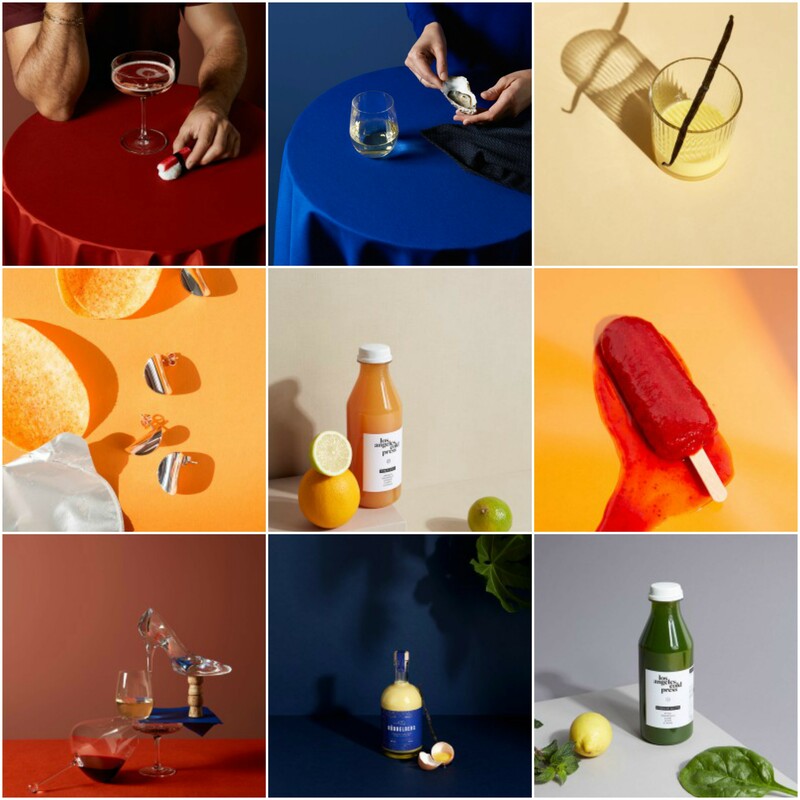
ContentIn this image, it shows three blood oranges, and one that is opened. You can tell that this photo has been taken recently because the photo is quite crisp and clear. You can also assume that a good camera was used. The colour used in this photo is extremely vibrant and suits the theme I have chosen. I think that the photographers have used an A3 piece of paper (with a pale colour), and have made the blood orange stand out in the centre. I think that Jacob Reishcel have made the right decision about using a pale colour in the bakground, with something that stands out in the middle.
CompositionIn the photo, there is a clear focus point purposely being shown, in my opinion. I think that the photo is blended together well as the colours match nicely. The photographers have used black lines to bascially draw the outline of the shapes. I think that this is a good idea becuase it makes it look the picture even more modern and unique. For this photo, a tripod may have been used. I think it has been used because it is a studio shot, and would have been easier to use in this situation. In my opinion, there is no use of rule of thirds as the main focus point is the in the centre and 2 blood oranges are around the focus point.
ConnectionThis theme is relevant with theme as it what I want to do with my images. I chose this photo because I want to try and make my final outcomes look like this. I think that the main message behind this image is to show how simple it is to make a photo look this contrasting and effective. Despite the fact that a lot of work has been put into it, the photographers have made it look simple and clean.
CommentThe thing that I like about this picture is the way Jacob Reischel is that they have used black lines to outline the blood oranges. This is something that I would like to do with my work. Also I like the use of colour that is used, especially the pale background. Something that I dislike about the photo is the fact that the pale pink doesn't cover the whole photo. In my opinion this would have made the photo look even better. I think that the photographers saw the shapes/ blood oranges as an art form, especially the black outline.
|

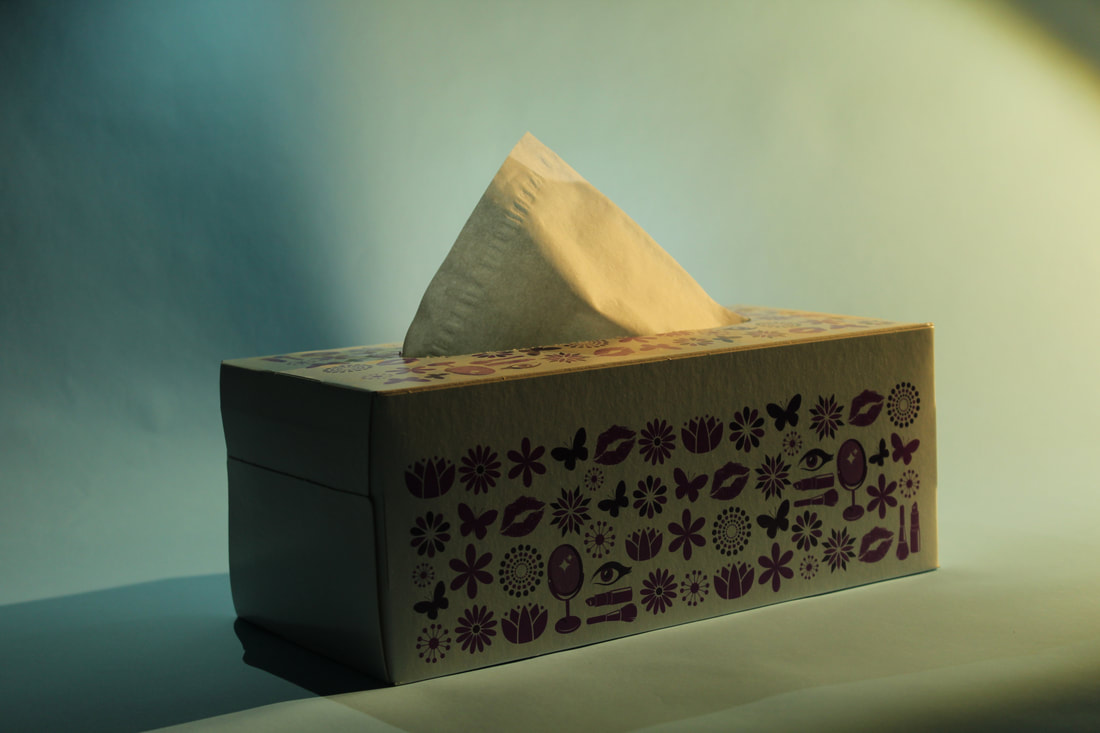
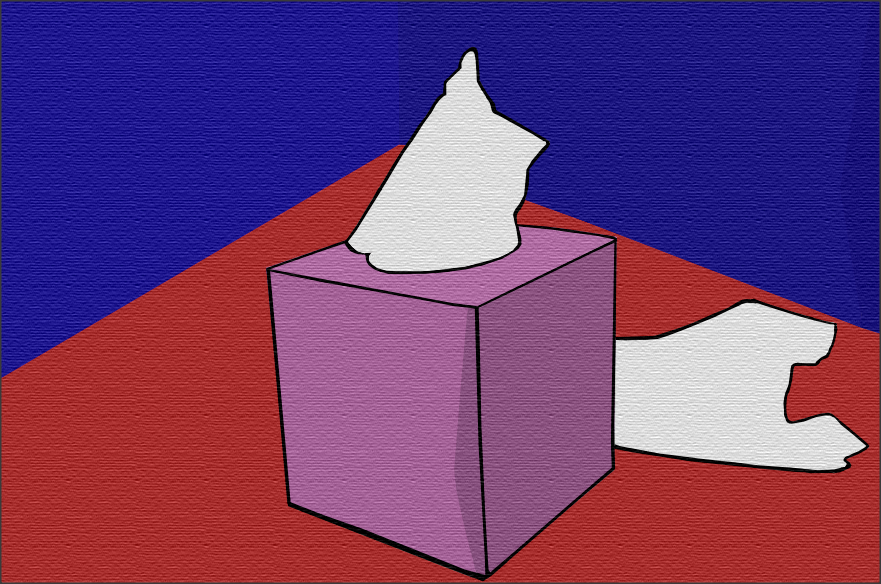
Contentin this image it shows a vibrant, pink tissue box lying on a bright red table with a vivid purple background. You can assume that the photo is quite modern due to the quality and class of the picture. Unlike the image from Jacob Reischel, this one uses crisp, intense colours which makes everything in the image stand out. I think that this photo is a studio shot as everything is set up perfectly. The photo just shows a tissue box/ structure and doesn't show any people, which makes it look professional.
CompositionIn this photo, there are 4 clear photo points (the red table, the pink tissue box, the white tissues and the purple background). For me, this is a perfect use of trying to use multiple colours and use them in one photo. You could argue that 2 thirds of the photo is covered by the tissue box and red table, and 1 third is covered with the background. When I first saw this photo, my eye was drawn to all four colours used, however when I looked closer, my attention focused on the white tissues as they were the brightest colour. There is no depth of field used, however it does try to focus on the tissue box. You could insist that the foreground is the table, the middle is the tissue box and that the background is the purple wall, however I think that the foreground is the tissue box and table and that there is no middle.
ContextThis photo was named tissue box by Ilka & Franz. It was shot for Spiegel Wissen, (a german magazine illustrator) to illustrate issues around viruses and bacteria, London. The meaning behind this image is to show how many people are suffering from viruses and bacteria, as stated before.
Connection'Tissue Box' links to my work as I would like to take images in studios, and I would like to use lots of colour. I have chosen this photo because it is a solid idea of what I want to do, however I have to take this idea even further by manipulating it with Photoshop. Regardless of how undemanding the image looks, it will be difficult to do something like this.
CommentA strength that I would give this picture is the use of colour. Ilka & Franz have even created shadows to make colours appear darker and lighter. Something that I feel could be improved is the use of rule of thirds. I think that they should show this clearly as it's complicated to see if there actually is a rule of thirds. I will definitively use this idea in my work.
|
Plan for my first photoshoot

First Photoshoot


Second Photoshoot


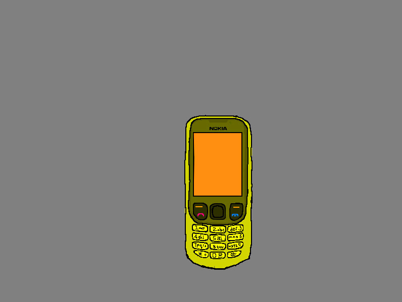
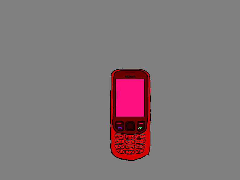
First edit


Final outcome
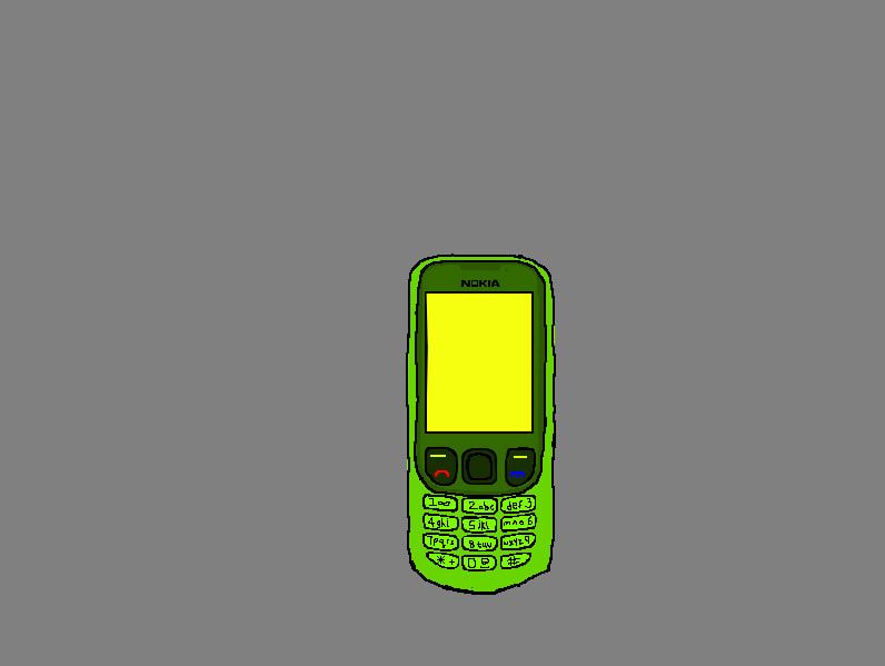
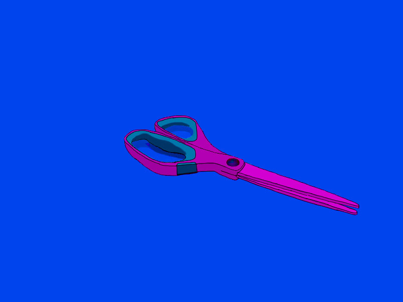
Second edit


Final outcome
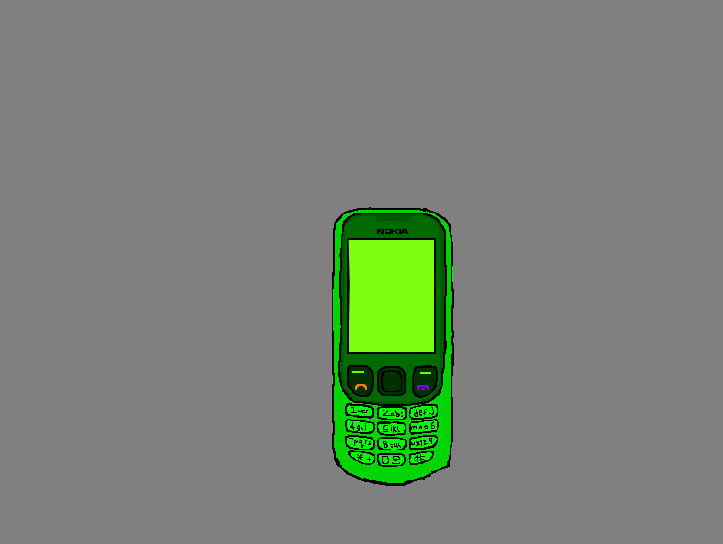
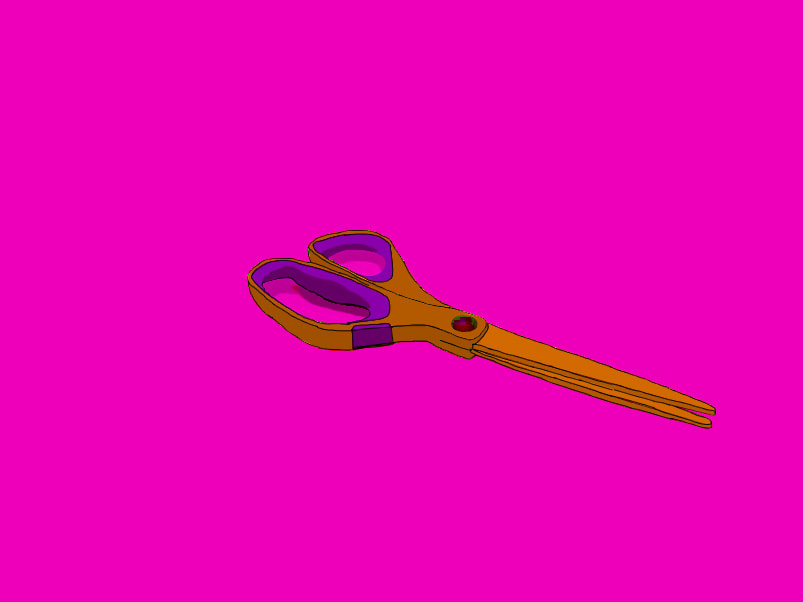
Third edit

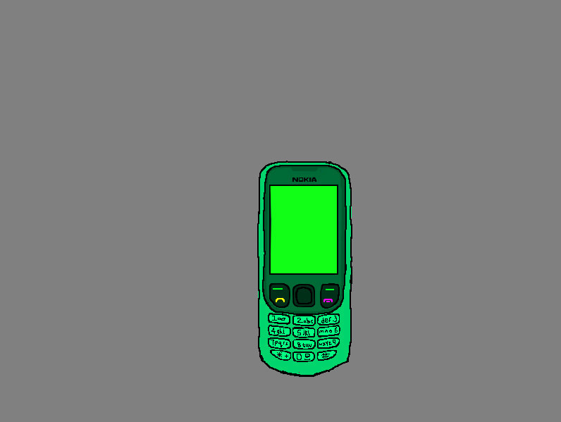
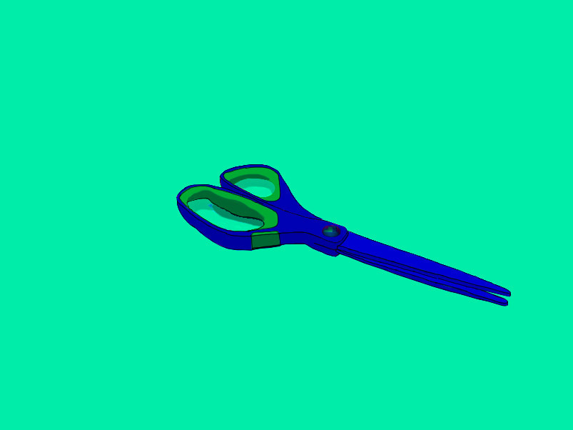
Fourth edit


Fruit


Lego Figures


Highlighters


Adriana Tavares

|

|
Adriana Tavares is an artist who creates lots of colourful objects and lays them out as if she is going to take a photo of them, however she paints the photo. She takes objects that are used everyday , and she turns them into colourful patterns, drawings and designs. She redesigns colours and shapes and turns objects used in everyday life into something special. In the left photo she is creating the objects, and the second photo is her final outcomes. The photo shown on the right is one of her more recent and interesting projects, and is called 'Invasion Of Privacy'. She borrowed some people to help her create all the colourful designs.
4th edit

Fifth edit


|

|
I used the 'Rough Pastels' filter to make my work look similar to Adriana Tavares', as all of her work is drawn.
Timelapse Edit 1
Timelapse Edit 2
29/04/2019- From this point I will not touch my preparation work. I will only use work from my exam.
Photoshoot With Professional Photographer


Edit 1


Final outcome


Edit 2
|
|


Edit 3


Final outcomes
|
|
|
|

|
|

|
|
|
|
Edit 4


Final outcomes
|

|

|
Final gallery


|
|
|
|
Evaluation
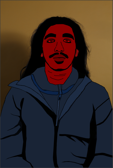
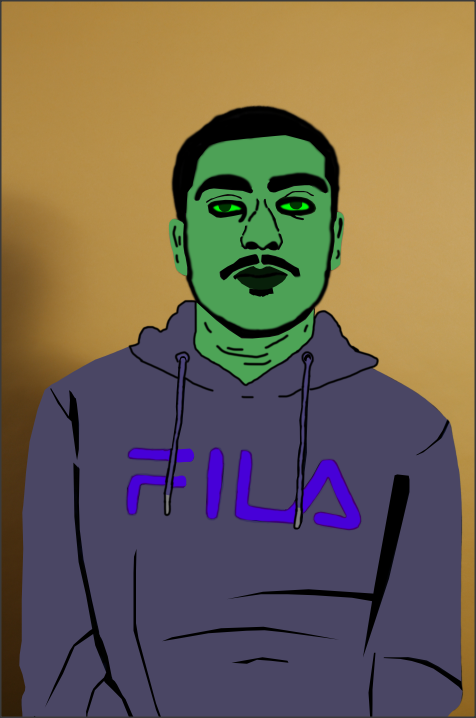
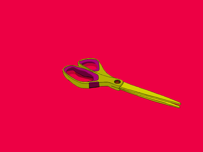
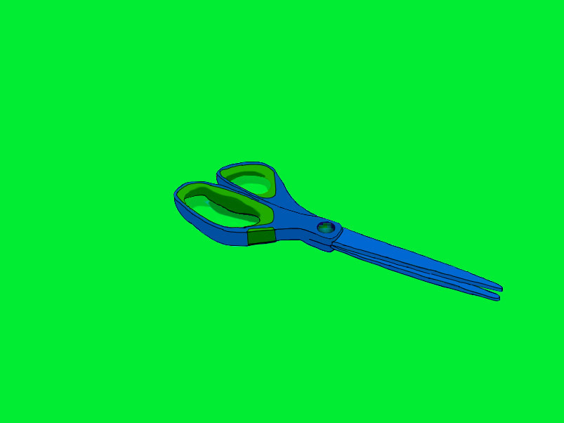
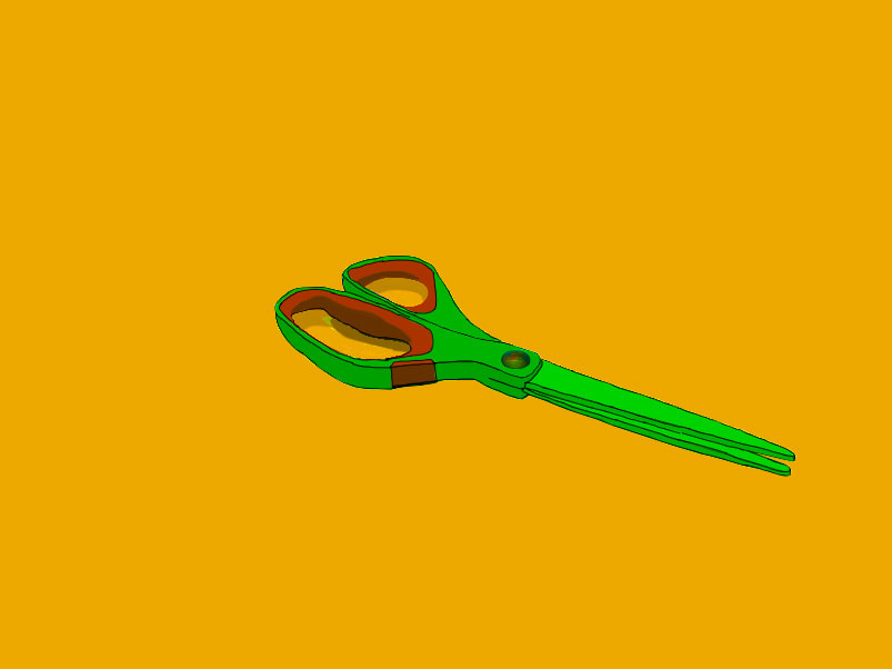
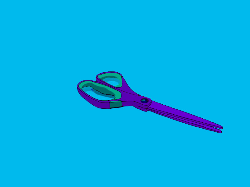
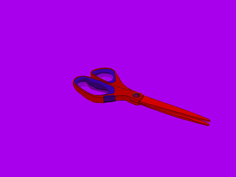
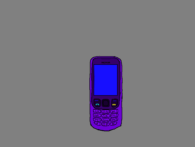
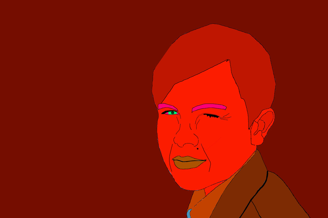
The topic that I chose for the exam is called ‘The Choice Of Colour’. I started by looking at different ways I could portray colour and how I could make it stand out. For my first photoshoots I took some images of colourful objects and tried using Photoshop to manipulate them. I realised that the final outcomes weren’t really effective as I couldn’t really develop a colourful object except change the background. I then started taking images of normal objects and was easier to manipulate and add colour to them. I then went from objects to faces.
During this project, the part that I enjoyed the most was using Photoshop to transform my photos. I really enjoyed it because there are so many ways you can manipulate photos and I could always experiment with the different tools. My most used tool was the polygonal lasso tool. It allowed me to go around the object and fill in certain sections.
A new technique I discovered on Photoshop was the eyedropper tool. If I was filling something in and missed a section, I could use the tool to tell me the colour I was using incase it had changed. It saved me having to back a lot of the time.
A photographer that I researched is called Michael Craig Martin. I inspired from his work as the way he used colour was so similar to what I wanted to do. I also looked at a painter called Adriana Tavares. She gathered lots of coloured objects and piled them together.
I feel like the most successful part of my project is my final outcomes towards the end of my exam. I think that the final Photoshops were the most developed and showed my progress from the start of the exam.
The main problem I encountered for my exam work was trying to find the right path that I could take this theme. At the beginning of the theme I was struggling when trying to find what I could do to make my work unique. I then started looking at photographers which inspired me.
If I had a chance to do the project again, I would make sure that I would do a lot more outcomes. As I was struggling to create outcomes at the start, I would make sure that I would take the right images and create developed outcomes from the start
