"Isn't It Strange That We Talk Least About The Things We Think About Most"
Statement Of Intent
My aim for this project is to demonstrate my ideas based around the them 'Weird And Wonderful'. At the end of this project, I will put my best photographs together so they can be easily viewed.
For the beginning of my research, I will start looking at photographer Renon Goldman. I chose this photographer as I like the way he portrays his work as he has meanings behind his photos. His work also inspires me to do the same thing with my work. I feel that Goldmans work is important in today's modern society as weird and wonderful photography can be seen almost anywhere. Goldmans work also makes us feel as though the photos are real. I would like to do this in my work.
When I chose this theme, I had lots of different ideas on what type of photos I could take and where I could take them. After thinking more carefully and doing research about the theme, I realised that I could take pictures of almost anything, and then editing them on Photoshop to make them link back to the topic.
To show my progression throughout my work, I will start by taking photos in areas with lots of trees. I will do this because weird and wonderful photos look best in dismal areas with lots of trees and nature. I will then develop my work even further by editing the photos on photoshop to make them look 'Weird and Wonderful'.
I would like to try and use a range of different techniques within this project. One that I am excited to use is Photoshop, because Photoshop can really change the way the actual picture looks by changing colours, and making photos look unreal.
Mind map for Weird and Wonderful

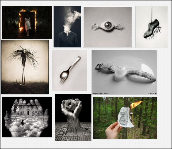
Moodboard
Salvador Dali- The Persistence Of Memory

This painting by Dali was painted in 1931 and is one of his most famous artworks. In this painting, Dali is trying to show how 'useless' and 'irrelevant' time is in this painting. The melting clocks could be symbolizing the way time feels when we are sleeping. If we look at the painting in the perspective of a dream, the clocks don't have any power while we're asleep and therefore are melting away. Dali called his paintings hand-painted dream photographs.
This image shows a scene of pocket watches, detached from their chains, melting slowly on rocks and branches of a tree, with the ocean as a back drop. A part of the painting is placed in sunlight and a part is covered in a shadow. Looking carefully you can see too small rocks, one in the sunlight and the other in the shadow. The colours Dali has used mainly brown because he uses it in the whole foreground. There is a contrast between the brown and the blue/ white and yellow sky. The way the background contrasts with the foreground makes it seem like the background is possibly floating.
Dali has used rule of thirds to separate the foreground and the background. 2/3 is the foreground and the rest is the background. This makes the foreground stand out. He has painted it very smoothly and could almost be realistic. There is a contrast between the cube and the melting clocks, the harsh lines against the soft lines of the clock makes a bigger impact on the viewer. My eye is drawn to the watch at the front of the foreground, this is because there is an unnerving, unusual shape that is sitting underneath it. You could assume that the object has something to do with nightmares because of the way it looks. It is hard to tell what this object is, but it almost looks like a melting sofa. You could tell that the sun is directing towards the top right of the painting because there is a bright yellow and white there. This colour blend does not appear anywhere else in the picture.
In my opinion I think that the melting watches are trying to say that time is flowing and eternal, unlike the hard rocks as they are the reality of life and the ocean represents the greatness of the earth. The strange looking human figure in the center could be showing that this is a dream because it looks as though the person is in a dream himself, because of how he is in the picture. Dali's picture could link to my work as I could try making some objects in my pictures look unusual and melting. I could do this on Photoshop using the smudge tool.
Chema Madoz- 5Cs

Content
In this picture Madoz has used a black and white effect. The photo looks quite modern as the quality of the photo is clear. I think that this photo has been taken in an empty room. In the photo I can see ladders colliding into a mirror, however it looks as though there are also ladders on the other side. This photo is just a structure as there are no people and this is what makes the photo look natural and surreal. I think that the meaning of the photo is to try and mess with the viewers mind with the optical illusion and surrealism.
Composition
In this photo, the focus point in in the center as this is where the ladder and the mirror is. In the picture there is a darker shade towards the bottom of the picture but is light in the main area of the image. My eye is drawn to the ladders and the mirror because I really like the way Madoz has used surrealism here. Rule of thirds and depth of field hasn't been used, and I don't think that a tripod has been used either. I think that Madoz has created this effect by not actually having a mirror. I think that he has used two ladders and made them lean against each other to create the surreal effect. I also think he has purposely made the other side a have a bright light to make us feel like the mirror is showing something different.
Connection
The theme in this picture is surrealism and this is relevant to my work because I am going to try and put surrealism into my work ( I will try and use his images to help me refine my own outcomes). I like the way Madoz has used experimentation to enhance the image, and I am going to try and do this in my work. I don't like most of Madoz's images however I like this one as it matches what I want to try and do with my work.
Comment
The thing that I really like about this picture is the surrealism that Chema Madoz has used. This really catches my attention straight away as it is in the center of the picture and it is the first thing that viewers will see. The thing that I don't like about this picture is the small miror. In my opinion, I think that the photo would have looked better if the mirror was a bit longer so you could see what was on the other side, unless it was the photographers intention to make the viewers think about what could be on the other side. I think that the main meaning of the image is to try and mess around with the viewers mind because of the surrealism.
Rene Margritte
Magritte's work had a major impact on a number of movements that followed his death, including Pop, Conceptualism, and the painting of the 1980s. In particular, his work was hailed as a harbinger of upcoming trends in art for its emphasis on concept over execution, its close association with commercial art, and its focus on everyday objects that were often repeated in pictorial space. It is easy to see why artists such as Andy Warhol, Martin Kippenberger, and Robert Gober cite Magritte as a profound influence.
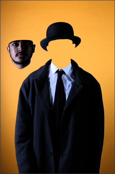
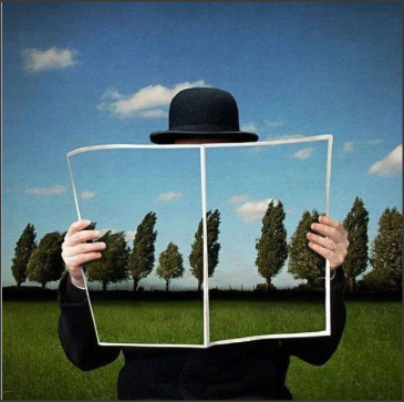
Rene Magritte- The Pilgrim
'The Pilgrim' is one of Magritte's most famous paintings because he makes it look powerful by using simplicity and clarity. In this photo Magritte uses a blue background and makes the person wear a darker blue suit along with a white shirt and a red tie. He also put dark blue buttons on the blazer. 'The Pilgrim' was created in 1966, only 1 year before his death. The painting was made by Rene Magritte who knew about the paintings backstory. There was no other information given about the painting other than it was painted in 1966. The pilgrim in French is called Le Pelerin, the name that it was originally called by Magritte.
The painting is done in portrait. The title changes the way we see the work as 'The Pilgrim' as it has nothing to do with the painting. None of the work is exaggerated as it is simplistic and barely has any detail. Magritte has used a lot of blue in this painting. All of the background is filled with light blue and the person's blazer and hat look dark blue/ black. His tie really stands out because there is no red in the picture except his tie. Magritte has also used white for the colour of the shirt. I would say that there is a contrast between the blue background and the dark blue blazer because they are both the same colour.
In my opinion, I would say that Magritte has painted this photo to show his creative idea and passion for creating weird and wonderful paintings in the society he was living in. I like the way Magritte has placed the man's head on the side of him. I could use this idea and portray it using Photoshop. The thing I don't like about the picture is that Magritte has given the man a white shirt. Personally I would have given him a blue shirt so that everything blends in apart from the red tie, which I think would make the picture look better.
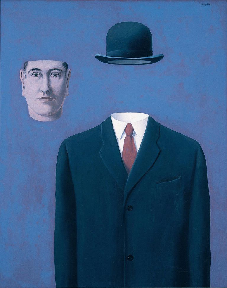
In this image, the median Magritte has used is paint. This is because the painting was done a very long time ago, and there cameras were not as common. The main colours Magritte has used in the image are black, green, white and mostly blue. Around 2/3 of the image is filled with the blue sky, starting with a darker shade of blue then changing to a lighter shade. 1/3 of the picture is the greenery (the grass and the trees). The bottom third of the picture uses a smooth texture to show the grass. The top 2/3 of the picture also uses a smooth texture, in my opinion.
At the time of the photo, there were lots of philosophers and scientists. This fact can change our perception of the image as we could infer that the man in the painting is one of the people from the fact. Also we could infer that this photo was taken a long time ago because the top hat the man is wearing tells us about the time it was painted. Because of the top hat we can guess that the painting was done during a world war as top hats were quite popular then.
This painting, by Rene Goldman, is about a man who is reading a newspaper but from the perspective we are in, the newspaper becomes hollow and shows us the background. I don't think that any of the painting has been exaggerated because Rene Goldman uses simplicity in his artwork, and he done it really well here. I believe that the photo is a realist depiction, however there is no proof that this painting is based off something Magritte has seen.
Magritte's work makes me feel as though I am in the picture because the surrealism in the centre of the picture makes it feel like I am the man reading the newspaper.
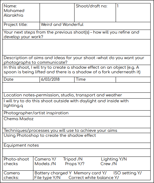
Photoshoot Plan 1
Plan for next shoot
Equipment- DSLR camera 10
Assistant- N/A
Location- Outside (may be inside)
Viewpoint- Mid view
Props- An umbrella
Models- 1 person
Time of day- 9am-10am
Type of images- I want to get images with someone holding an umbrella, and then I will edit the photo on Photoshop to make it relate to Weird And Wonderful
Assistant- N/A
Location- Outside (may be inside)
Viewpoint- Mid view
Props- An umbrella
Models- 1 person
Time of day- 9am-10am
Type of images- I want to get images with someone holding an umbrella, and then I will edit the photo on Photoshop to make it relate to Weird And Wonderful
Longford Park Photoshoot

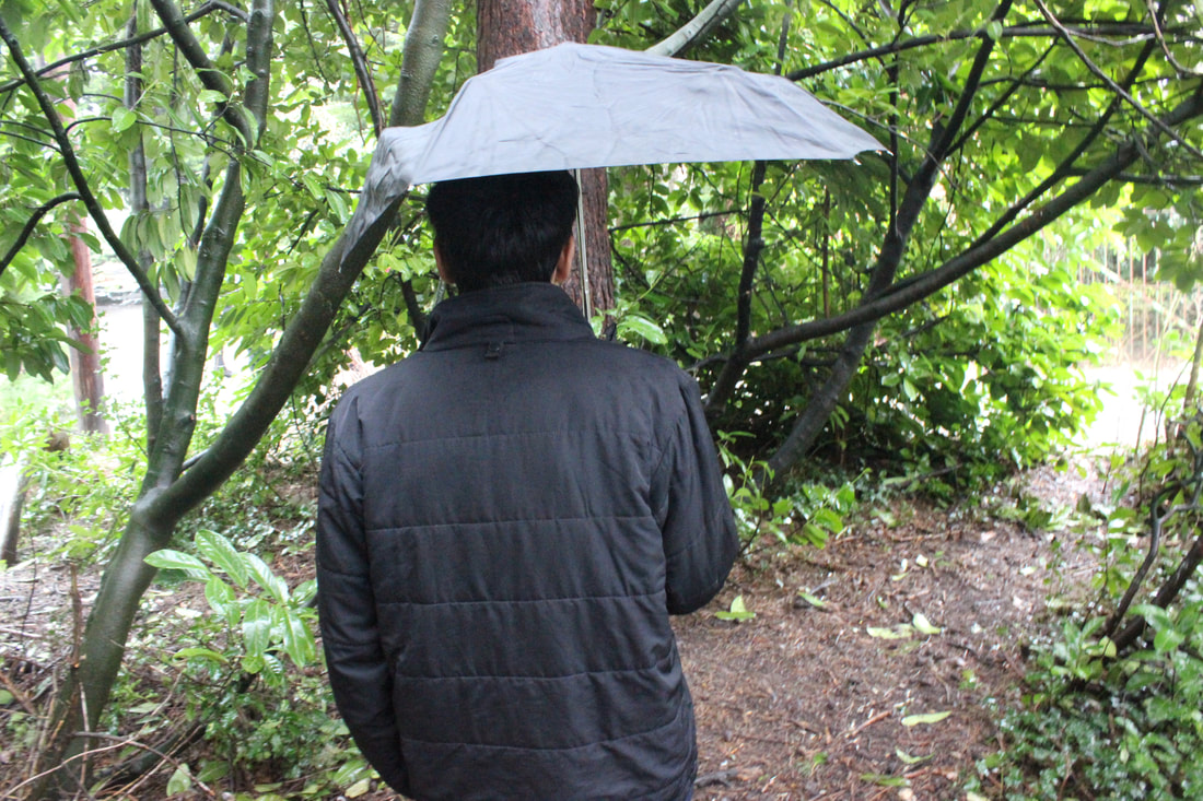


Weird and wonderful- 1st edit


(Without filter)

Photoshop steps
Firstly I used the clone stamp tool to remove the face and hand, and replaced it with the surroundings. I also used this tool to extend the shaft/handle.
For the filtered version, I added a plastic texture.
Weird and wonderful- 2nd edit


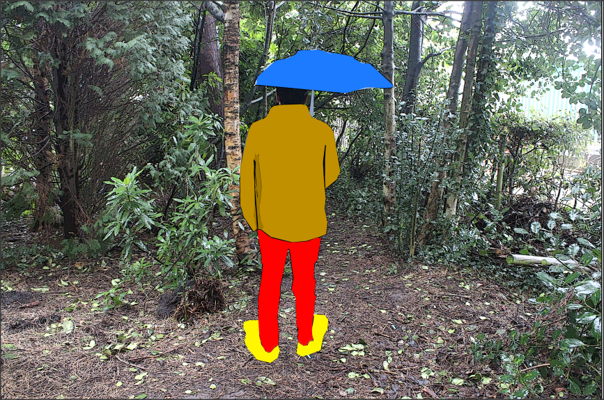
Photoshop steps
For everything I edited in this image, I used the polygonal lasso. I cut around everything and used the fill tool to change the colour. I also went around some edges in black.
Photoshoot Plan 2
Photoshoot 2


Photoshoot 3


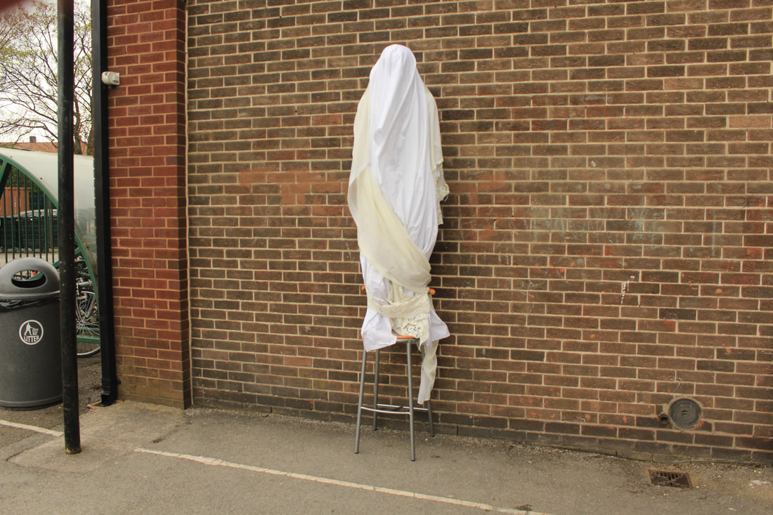


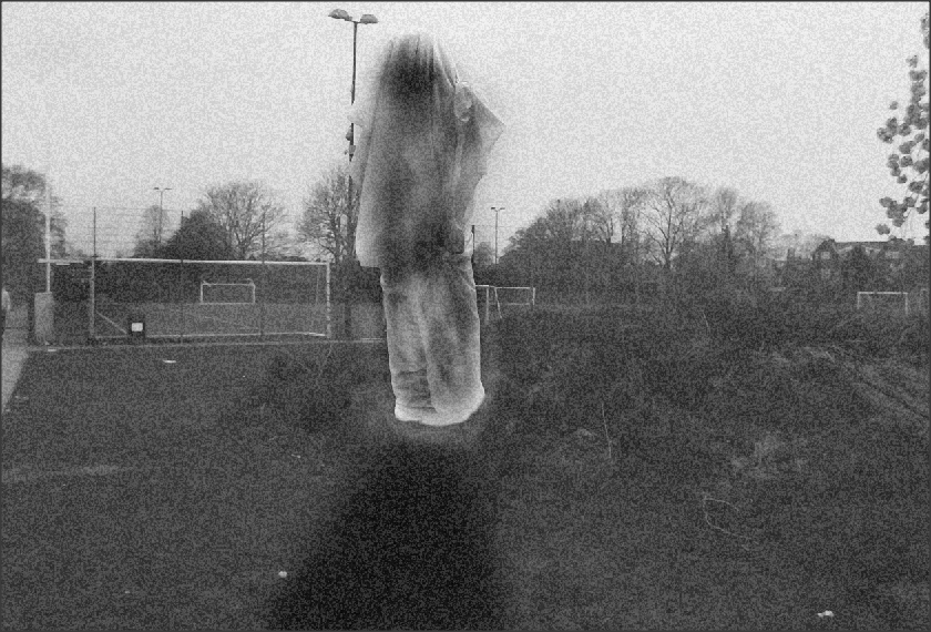
Weird and wonderful- edit 3


(Without filter)

Photoshop steps
First I added a black and white layer.
Then I used the clone stamp tool to replace the stool and the bottom of the cloth with the surroundings.
Lastly I used the smudge/burn tool on the cloth and the floor to give it a more sinister effect.
On the filtered version, I used the film grain texture.
Evaluation
This project theme is called Weird And Wonderful. As conflict was quite a serious theme, weird and wonderful was a creative theme which could involve a range of different ideas. I took a more creative approach to weird and wonderful and this was the correct decision, in my opinion. We started this theme in March and finished it around mid-July.
The thing I enjoyed about this project was using Photoshop to develop my pictures even further. I liked this because Photoshop would make my final outcome even better. Also Photoshop is easy to use, and not a lot of knowledge is required to use Photoshop as there are some simple tools that you can use.
A new technique that I have experienced is the the clone tool in Photoshop. This helped me with my levitation images, as when I wanted to remove the stool, I could clone the floor and place it over the stool which would make it disappear. A technique that I would like to develop even further is the type of pictures that I am taking. I feel as though the pictures that I am taking are quite repetitive and that i need to show a range of images.
A photographer that really inspired me is Rene Magritte. I have done a lot of work about Magritte as I have based my work on his.
Photoshoot based on Magritte